Pampers Global Visual Identity
Pampers required a bold and distinctive refresh throughout its whole brand structure that would create a more premium feel across all its markets globally.
In recent years Pampers have taken on hard competition from a multitude of cheaper brands that have challenged their hold on the market. In order to reaffirm their quality, they required a shift in their visual identity that would also reflect the higher cost of their product and stand them above cheaper competition.
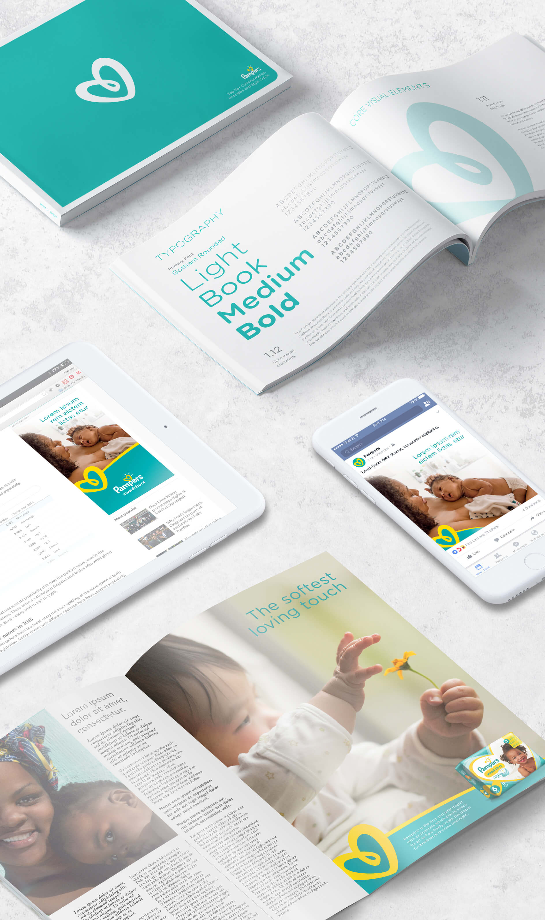
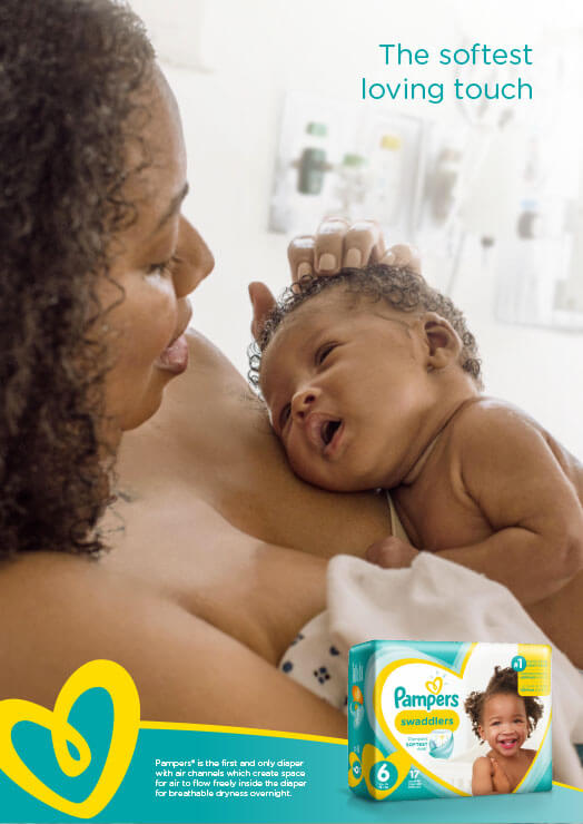
Looking at their brand from the ground up, we identified their iconic heart as their most distinctive asset. Heroing this, I created a design which boldly featured the heart as a flexible asset and utilised curves of their unique brand mark to create functional graphic devices.
Being such an established household brand around the world, it had many product lines and different markets to take into account so I needed to honour certain visual devices and find ways of incorporating these into a cohesive new style. The result was a refined look that maintained the heritage of this well known brand.


